 |
Organization Administrator's Guide
|
|
Organization Administrator's Guide
|
Themes allow the color schemes and logos utilized throughout the Safe Share web application user interface to be customized for individual organizations, where each individual organization is associated with its own theme. (For more information about adding/configuring organizations through Safe Share Administration, see Administering organizations in the Safe Share Administrator's Guide.)
In this version of Safe Share and the Covata Platform, themes are generated using an separate tool (the Covata/WebApp Theme Builder), which is developed by Covata and is available as a locally executable npm package.
These color scheme and logo customizations are also utilized throughout:
Newly installed instances of Safe Share are pre-packaged with the Covata default theme. This theme is initially used for all organizations' Safe Share web application and Organization Administration interfaces, email notifications, as well as the Safe Share Administration interface.
Using the WebApp Theme Builder tool, you can generate different themes - one for each organization - as well as your own default theme (aka the 'system' theme), which is used for:
Visit the covata-theme-builder page (on the npm web site) for more information about obtaining and using the WebApp Theme Builder tool, as well as deploying themes to a Covata Platform instance.
Note: Other customizable aspects of Safe Share, such as the Application Name, as well as the Company Name and Copyright Notice that appear in email notifications, are configurable through the System details properties section of the Configuration page of Safe Share Administration.
The following diagrams indicate the themable components of the Safe Share web application's user interface that can be customized using the WebApp Theme Builder tool. These themeable components include images/logos and other properties whose values determine color-usage, each of which is indicated below by its property name in the theme.properties file.
The main Safe Share page
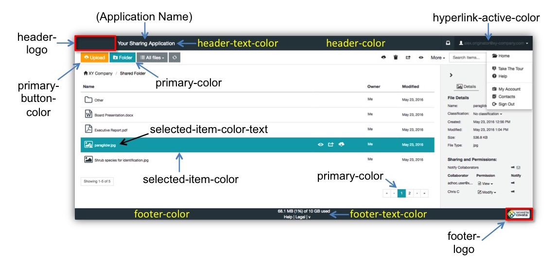
Note: The
primary-coloris also used for 'waiting' / 'processing' animations, which appear for example when a file's view is being downloaded.
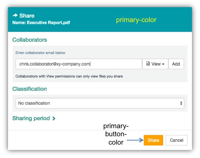
Dialog boxes
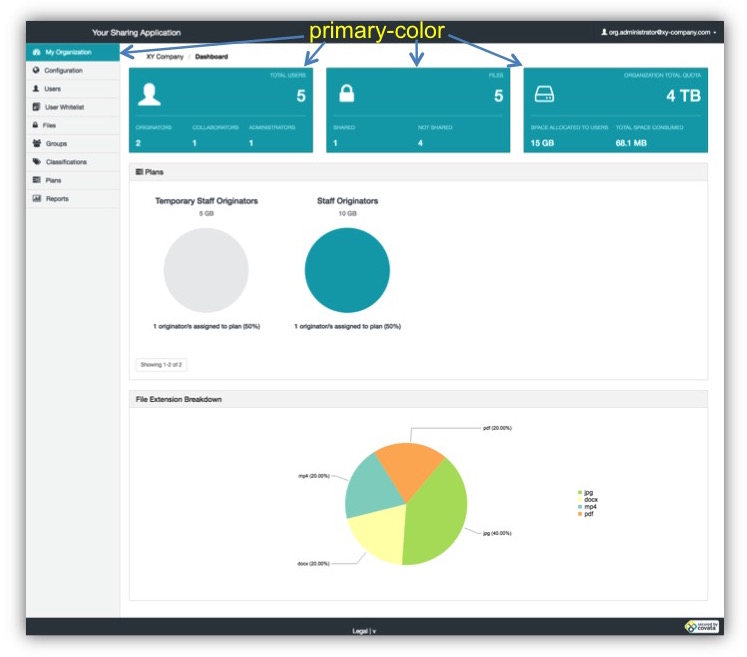
The following diagrams indicate the themable components of Safe Share's web-based administration pages that can be customized using the WebApp Theme Builder tool. These themeable components include images/logos and other properties whose values determine color-usage, each of which is indicated below by its property name in the theme.properties file.
The Organization Administration interface
For a given organization, any of its organization-specific components of the main Safe Share page (illustrated above) that have a specific property value, also affects the equivalent component in this organization's Organization Administration interface. The following diagram shows additional components, which do not have an equivalent in the main Safe Share page/interface, but are also customized using the WebApp Theme Builder tool.
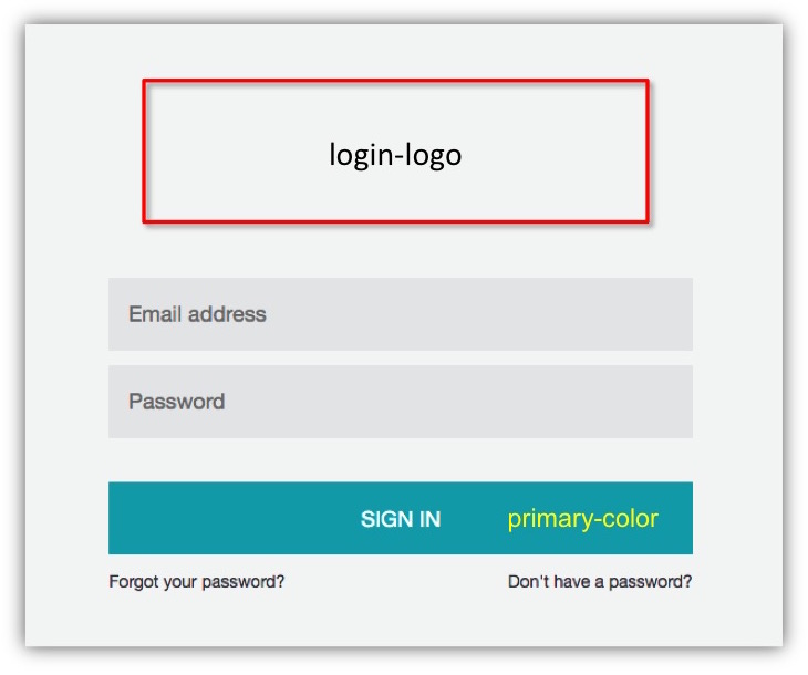
The following diagrams indicate the themable components of other areas and aspects of Safe Share (i.e. not covered above) that can be customized using the WebApp Theme Builder tool. These themeable components include images/logos and other properties whose values determine color-usage, each of which is indicated below by its property name in the theme.properties file.
Note: Only the logos/images and property values (of the
theme.propertiesfile) located inside the system theme's directory are used for the following areas.
The sign-in page
Email notifications
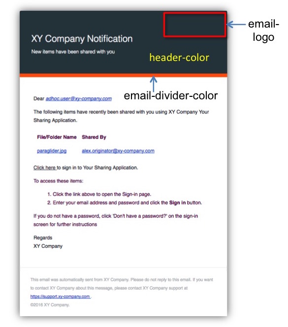
Note: It is currently not possible to theme email notifications on an organization-specific basis.